


Last Updated: November 8, 2026
Quick Summary
Choose cohesive wall art by pulling three colours from the room itself and repeating one or two of them in the artwork, then matching the mood to what the room is used for. Size art to roughly two-thirds to three-quarters of the furniture width below it, and repeat one anchor such as a colour, frame finish, or subject across every piece.
- Art should fill roughly two-thirds to three-quarters of the wall space above a piece of furniture.
- Centre artwork at eye level, typically 145-155 cm from the floor, or 15-25 cm above the furniture.
- Keep gaps between frames consistent at 5-7 cm so a group reads as one unit.
- Cap an eclectic wall at two mediums, three sizes, and one frame finish.
- Limit the whole home to a maximum of two frame finishes and buy one room at a time.
Table of Contents
- Start With Colour and Purpose, Not the Frame
- How to Choose Wall Art for a Living Room
- Scale and Proportion: Sizing Art to Your Wall
- How to Arrange Pictures on a Wall Different Sizes
- Gallery Wall Do's and Don'ts
- Eclectic Gallery Wall Ideas That Still Feel Calm
- A Cohesion Checklist for Choosing Art Across Rooms
- Build Your Cohesive Collection With LagomDesigns
- Frequently Asked Questions
Start With Colour and Purpose, Not the Frame
Most people shop for wall art backwards. They fall for a frame finish or a bold print, buy it, then spend months trying to make it fit a room it was never meant for.
Choosing cohesive wall art starts with two questions: what colours already live in this room, and what is this room for? Answer those first and the frames almost pick themselves. This guide walks through the decisions that matter most when building a cohesive collection.
Below, we'll show you exactly how to pick art that ties a room together, from colour matching to gallery wall layouts.
Matching artwork to your existing colour palette
Pull three colours from the room itself: the wall, the largest piece of furniture, and one accent you already love. Artwork that repeats one or two of those colours will always look intentional.
A common mistake is buying art that introduces a whole new palette. One new hue can work as a small accent. Three new hues will clash.
If you want to go deeper on pairing art with what's already in the room, our guide on how to match art to furniture colours walks through it step by step.
Letting room purpose guide the mood
Bedrooms and reading corners call for soft, low-contrast pieces. A home office needs art that doesn't pull your eye away from the screen. Hallways and dining rooms can handle more energy.
Match the mood to the job the room does, and the art will feel right without you being able to say exactly why.
How to Choose Wall Art for a Living Room
The best wall art for a living room is one large piece or a tight group that anchors the seating area, in colours pulled from the sofa, rug, or cushions.
Work through these steps:
- Measure the wall space above your main piece of furniture.
- Note the colours in your rug, sofa, and cushions.
- Decide on one focal point, not three.
- Pick art that repeats one or two of those colours.
- Hang it so the centre sits at eye level.
A living room is where cohesive wall art earns its keep. Guests see this room first, so a calm, unified wall reads as a designed home.
For a closer look at the living room specifically, our breakdown of living room wall art choices covers sizing and placement in more detail.
Scale and Proportion: Sizing Art to Your Wall
Art should fill roughly two-thirds to three-quarters of the wall space above a piece of furniture.
Here is a repeatable measuring process you can use for any wall:
- Measure the width of the furniture the art will hang above (sofa, console, bed).
- Measure the clear wall height from the top of that furniture to the ceiling or trim.
- Multiply the furniture width by 0.66 and by 0.75 to get your target artwork width range.
- For a single piece, choose a frame whose outer width falls inside that range.
- For a group, add the widths of all frames plus the gaps between them; the total should fall inside the same range.
- Mark the centre point of the furniture on the wall with a pencil; the centre of the art group should align to it.
A common pattern is to measure the wall but forget the furniture.
Here's how the width rule plays out in practice:
| Furniture width | Target artwork width (single piece or group total) |
|---|---|
| 90 cm | 60-68 cm |
| 120 cm | 80-90 cm |
| 150 cm | 100-113 cm |
| 180 cm | 120-135 cm |
| 240 cm | 158-180 cm |
For height, the centre of the artwork should sit at eye level, typically 145-155 cm from the floor, or about 15-25 cm above the top of the furniture, whichever looks right in the room.
When you are arranging multiple pieces, treat the group as one shape.
Watch out: a common mistake is sizing art to the wall rather than to the furniture.
If you are working with a very large wall and a single piece would exceed your budget, a tight group of three or four smaller frames can fill the same width and read as one unit. Our step-by-step gallery wall hanging guide covers how to space and align that group.
How to Arrange Pictures on a Wall Different Sizes
The trick to mixing different sizes is a shared centre line. Pick one horizontal line, then align every frame to it, whether the frames are tall, wide, or square.
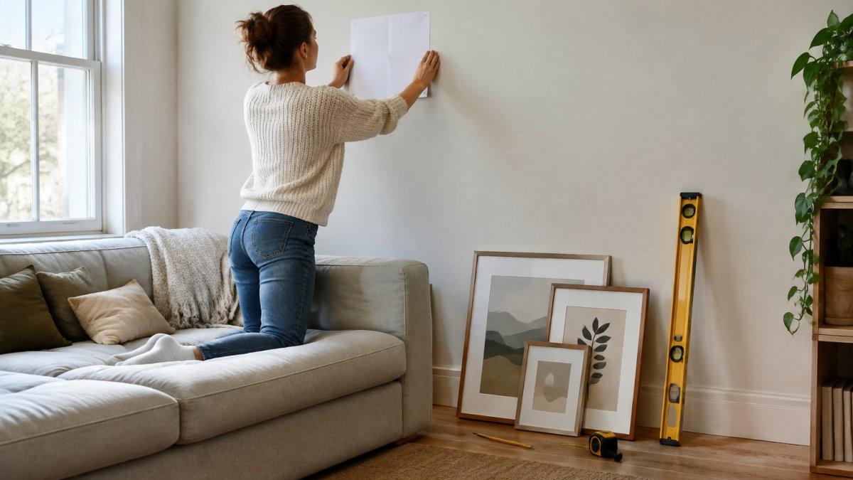
Start with the largest piece. Place it slightly off-centre, then build outward with smaller frames. Keep the gaps between frames consistent, around 5-7 cm.
Planning with paper templates and grid lines
Cut paper templates to the exact size of each frame. Tape them to the wall and live with the layout for a day before you hammer anything.
Use a light pencil line as your grid, and check it with a spirit level. Once the paper looks right, mark the hanging points through it.
When you're ready to hang, our step-by-step gallery wall hanging guide covers hooks, heights, and hardware.
Gallery Wall Do's and Don'ts
A calm gallery wall comes down to restraint. Here's what works and what doesn't.
Do:
- Keep spacing even between every frame
- Repeat one colour or frame finish across the group
- Anchor the layout to a shared centre line
- Mix sizes, but keep the total group tight
Don't:
- Spread frames across the whole wall
- Mix more than two frame finishes
- Hang pieces at wildly different heights
- Fill every gap with something small
For a small apartment, our guide to arranging a gallery wall in a small space shows layouts that work when wall space is tight.
Eclectic Gallery Wall Ideas That Still Feel Calm
Mixing styles doesn't have to mean visual noise. The secret is a shared thread: one colour, one frame finish, or one subject running through every piece.
Use this three-layer framework to mix styles without clutter:
Layer 1: Anchor. Choose one element that repeats in every piece. This is your cohesion thread. Pick one: a dominant colour, a frame finish, or a subject category (for example, all botanical or all architectural). The anchor does the work of tying the wall together so the styles can vary.
Layer 2: Vary. Change two of the following across the group: medium (photo, print, painting), subject (landscape, abstract, figure), and size.
Layer 3: Limit. Cap the number of variables. A practical limit is two mediums, three sizes, and one frame finish.
Try these approaches within that framework:
- One palette, many styles. Keep every piece within two or three colours, then mix photography with abstract prints.
- One frame finish throughout. Matching frames tame a wild mix of prints and paintings; the frame becomes the anchor.
- A shared subject. All abstract shapes, all botanical, all quiet landscapes, the subject is the anchor and the mediums can vary.
- A repeated shape. Circles, arches, or simple lines across different pieces; the shape acts as the anchor even when colours differ.
A common pattern is to buy five pieces in one shopping trip and end up with a wall that looks flat because every piece was chosen at the same moment with the same eye. Build slowly and let each new piece answer the last. A useful test: before buying, place the candidate piece next to a photo of the existing wall on your phone. If it repeats the anchor and varies only one other element, it will likely fit.
Watch out: mixing more than two frame finishes without a strong colour anchor is the fastest way to make an eclectic wall look like a thrift-store display. If you love variety in frames, keep the artwork palette tight.
Our minimalist gallery wall guide takes this further with layout rules that keep things calm, and our guide to arranging a gallery wall in a small space shows how to apply the framework when wall space is tight.
A Cohesion Checklist for Choosing Art Across Rooms
Choosing art for a whole home is where most people lose the thread. Each room ends up with its own palette, and the house feels disjointed.
Use this checklist before you buy anything:
- Pick one thread that runs through the whole home: a colour, a frame finish, or a subject
- List the main colours in each room
- Choose one accent colour that appears in at least two rooms
- Decide on a maximum of two frame finishes for the whole home
- Keep scale consistent: large rooms get large pieces
- Buy for one room at a time, in phases
Budget-conscious buyers can spread purchases across a few months. A phased approach also lets you live with each piece before adding the next.
Build Your Cohesive Collection With LagomDesigns
A calm home doesn't need a big art budget. It needs pieces that already agree with each other.
Every LagomDesigns print is professionally framed and ready to hang, available in four sizes and three frame finishes, so you can build a collection that stays consistent from room to room. Each piece is made to order on museum-quality matte paper sourced from Japan.
Our Meadow minimalist wall art is a good starting point: a warm peach ground with coral and sage that sits easily beside most palettes.

Start with one room, one thread, and one piece. Then build from there.
Choosing art that ties a room together takes a little planning, but the payoff is a home that feels settled the moment you walk in.
Frequently Asked Questions
How do you make different pieces of wall art look cohesive?
Repeat two or three elements across every piece: a shared colour, a similar frame finish, or a common subject like abstract line work. You do not need identical art. Choose a palette of two to three hues and let each print echo at least one of them. Keeping frame finishes consistent across a room does more for cohesion than matching the images themselves, and it lets you mix styles without the wall looking cluttered.
How much space should you leave between pictures in a gallery wall?
Leave 5 to 8 cm (2 to 3 inches) between frames for a tight, curated look, and up to 10 cm if the pieces are large. Measure the gaps with a ruler rather than eyeballing them, because uneven spacing is the most common reason a gallery wall looks unbalanced. Treat the whole arrangement as one unit and keep the outer gaps slightly wider than the inner ones so the group reads as a single shape.
Should all the art in a gallery wall match?
No. Matching every piece makes a wall look like a showroom set. A cohesive wall art collection shares a thread, such as a muted colour palette, a consistent frame finish, or a recurring geometric theme, while varying size, subject, and orientation. Mix one statement piece with two or three quieter prints, and keep at least one element identical across the group so the variety reads as intentional.
How do you choose wall art that works with a room's colours?
Pull one or two colours already present in the room, from a rug, cushion, or piece of furniture, and let the art repeat them. If the room is neutral, choose art with a warm paper ground and a single accent hue rather than a busy multicolour print. Order a small piece first to check how the colours look against your actual walls in your own lighting before committing to a larger set.


