


Table of Contents
- Why Minimalist Gallery Walls Need a Different Approach
- Step 1: Plan Your Gallery Wall Layout Ideas Before You Hang Anything
- Step 2: Pick a Gallery Wall Template That Fits Your Wall
- Step 3: A Gallery Wall Spacing Guide With Exact Measurements
- Step 4: How High to Hang a Gallery Wall (And How to Measure It)
- Step 5: Frame Finishes, Renter-Safe Hanging, and Lighting
- A Complete Minimalist Gallery Wall Example You Can Copy
- Frequently Asked Questions
Last Updated: October 14, 2026
Why Minimalist Gallery Walls Need a Different Approach
Minimalist gallery walls are groups of framed artworks arranged on one wall using restraint, negative space, and a limited palette instead of maximum coverage. At LagomDesigns, we see the same pattern again and again: people fill the wall, then wonder why the room feels busier, not calmer.
Most gallery wall guides push a "more is more" look. That works for an eclectic room. It fails in a calm one.
A minimalist wall needs three things:

- Fewer pieces (three to six, not twelve)
- Generous gaps between them
- One clear palette and one frame finish
Get those right and the wall reads as quiet and deliberate. Get them wrong and it reads as clutter with better lighting.
Step 1: Plan Your Gallery Wall Layout Ideas Before You Hang Anything
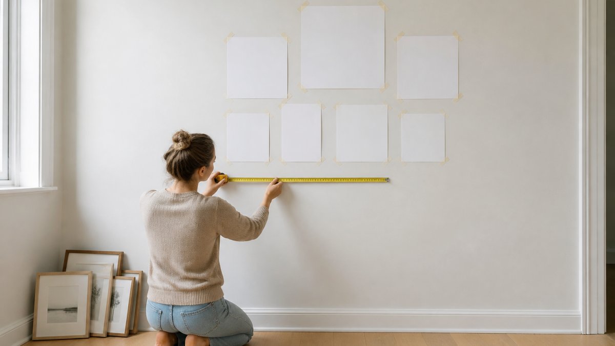
The best gallery wall layout ideas start on paper, not the wall. Measure the wall, cut paper templates for each frame, and tape them up before committing to a single nail.
Here is a simple planning order:
- Measure the wall's width and height
- Note where furniture, switches, and light sources sit
- Cut paper to each frame's exact size
- Tape the templates up and step back
- Live with the arrangement for a day before hanging anything
That last step saves the most time. A layout that looks fine from two feet away often looks wrong from the sofa.
Choosing an Anchor Piece and Balancing Visual Weight
Every minimalist gallery wall needs one anchor piece: the largest artwork in the group. Hang it first, then build outward.
Visual weight is how heavy a piece feels, not how big it is. A dark, high-contrast print carries more weight than a pale one of the same size, so balance it with empty wall space, not another heavy piece.
A few practical rules:
- Place the anchor slightly off-center for an organic feel
- Pair one large piece with two smaller ones
- Keep the second-largest piece noticeably smaller than the anchor
- Leave more empty wall than you think you need
Building a Cohesive Palette With Neutral and Monochromatic Art
A cohesive palette separates a calm wall from a chaotic one. Stick to two or three tones across every piece.
A monochromatic color scheme uses one hue in different shades; a neutral palette uses warm whites, soft greys, sand, and muted black. Both work in minimalist interiors because nothing competes for attention.
When choosing art prints, look for:
- A shared tone across all pieces
- One accent color used at most twice
- Matte finishes that absorb light instead of bouncing it
- Simple abstract or geometric compositions
This is where most people go wrong. They buy six beautiful prints from six different moods, then wonder why the wall feels loud. Buy one mood, six times.
Step 2: Pick a Gallery Wall Template That Fits Your Wall
A gallery wall template is a fixed arrangement pattern you can copy. For minimalist walls, three templates cover almost every situation: grid, organic, and asymmetrical. What separates a calm result from a cluttered one is the exact geometry you apply, not the template itself.
| Template | Best For | Pieces | Difficulty | Exact Geometry |
|---|---|---|---|---|
| Grid | Symmetrical walls, offices, hallways | 4-6 | Easy | Equal gaps on all sides; aligned top and bottom edges |
| Organic | Living rooms, collected look | 3-5 | Medium | Anchor off-center; gaps vary by 1-2 cm only |
| Asymmetrical | Awkward, narrow, or long walls | 3-7 | Harder | Balanced visual weight, not mirrored edges |
Pick the template based on the wall, not the art. The wall decides the shape.
Grid, Organic, and Asymmetrical Layouts Compared
Grid layout. A grid uses equal spacing and aligned edges. For a 2x2 grid of four same-size frames: total width = (frame width x 2) + gap. With 40 cm frames and a 7 cm gap, the group is 87 cm wide.
Organic arrangement. An organic layout builds outward from the anchor with uneven gaps, but keep every gap within 1-2 cm of the others.
Asymmetrical layout. An asymmetrical layout balances different sizes across the wall without mirroring.
Adapting Templates for Small, Narrow, and Awkward Walls
Small and oddly shaped walls are where most gallery-wall guides give up.
Narrow wall above a desk (under 90 cm wide). Skip the grid and use a vertical column of three same-width prints.
Stairway wall. Follow the slope: place each frame's center roughly 90-100 cm above the stair nosing directly below it.
Corner wall. Wrap only two pieces around the corner, and keep them at the same center height.
Very tall wall. Do not stretch a small group upward.
Renters should lean on adhesive strips and lightweight frames.
Step 3: A Gallery Wall Spacing Guide With Exact Measurements
A gallery wall spacing guide comes down to three numbers: 5-8 cm between frames, 15-25 cm above furniture, and 144-152 cm to the center of the arrangement.
Bauhaus Riso Constellation - Premium Framed Poster →
Use this spacing guide as your baseline:
| Measurement | Target | Why |
|---|---|---|
| Gap between frames | 5-8 cm | Keeps the group reading as one unit |
| Gap above furniture | 15-25 cm | Ties art to the sofa or desk |
| Center height from floor | 144-152 cm | Standard eye level |
| Gap from ceiling | 15 cm minimum | Avoids a cramped look |
| Gap from corners | 10 cm minimum | Gives the wall room to breathe |
How to Calculate Spacing for Each Layout
Grid layout. Total width = (frame width x number of columns) + (gap x number of gaps).
Organic layout. Start with the anchor, then place each additional piece so its nearest gap falls between 5 cm and 8 cm, never exceeding 8 cm, even if the arrangement is uneven.
Vertical column. Total height = (frame height x number of frames) + (gap x number of gaps).
Single row. Total width = (frame width x number of frames) + (gap x number of gaps).
Adjusting Spacing for Wall Size and Frame Weight
Consistency matters more than the exact number. Pick one gap and repeat it everywhere.
For a small wall, tighten the gaps to 5 cm. For a large wall, widen them to 8 cm. Never go below 5 cm, or the frames start to crowd.
Frame weight also affects perceived spacing. A dark, high-contrast frame carries more visual weight than a pale one of the same size, so it tolerates a slightly wider gap without feeling disconnected.
Step 4: How High to Hang a Gallery Wall (And How to Measure It)
The answer to how high to hang a gallery wall is 144-152 cm from the floor to the center of the group, matching average eye level for most adults.
Here is how to measure it in four steps:
- Measure from the floor to 147 cm and mark the wall lightly
- Find the total height of your arrangement, including gaps
- Divide that number in half
- Measure down from your mark by half the total, and that is your top line
For a wall above furniture, use the 15-25 cm rule instead: hang the art so its bottom edge sits about 20 cm above the sofa or desk, keeping it connected to the furniture below.
Ceiling height changes things: in a room with tall ceilings, hang slightly higher; with low ceilings, stay near the lower end of the range.
Step 5: Frame Finishes, Renter-Safe Hanging, and Lighting
Frame and lighting choices decide whether a minimalist wall looks calm or flat. Stick to one finish across every frame, and light the art without glare.

Frame style options that suit a minimalist wall:
- Matte black frames for contrast on pale walls
- Pale wood frames for warmth on white walls
- Thin profiles that let the art, not the frame, lead
Mixing frame styles is possible, but keep it to two finishes at most.
For renters, adhesive strips and small nails leave the least damage. Our frames ship ready to hang with hardware included.
Lighting matters more than most people expect. Aim light across the art, not straight at it. Glare hides the print and washes out pale tones.
guidance on hanging and displaying art safely
A Complete Minimalist Gallery Wall Example You Can Copy
- Anchor: one large framed print, 61 x 91 cm, centered at 147 cm
- Two medium prints, 45 x 61 cm, one on each side
- Two small prints, 30 x 40 cm, filling the lower gaps
- Gaps: 7 cm between every frame
- Frame finish: matte black throughout
- Palette: warm white, sand, and soft grey
Total width comes to about 200 cm, leaving 20 cm of empty wall on each side.
If you want a simpler version, drop the two small prints. A three-piece group on a 240 cm wall looks just as finished.
Our Neutral Shapes Minimalist Wall Art and Shape and Shadow Minimalist Wall Art both work as anchor pieces in this layout.
interior design guidance from the Royal Institute of British Architects
Frequently Asked Questions
Is there a specific way to arrange a gallery wall?
There is no single rule, but minimalist gallery walls work best with a clear structure. Start by choosing one anchor piece, then build outward with 2 to 4 smaller prints. Keep the gaps between frames consistent, usually 5 to 8 cm, and hold the whole group to a shared palette of two or three tones. A grid or loose organic arrangement both work, as long as negative space stays generous rather than filled.
How do you space frames on a gallery wall?
Use one consistent gap across the whole arrangement. For minimalist gallery walls, 5 to 8 cm between frames reads as calm and deliberate, while tighter gaps of 2 to 3 cm feel busier. Measure the gap from frame edge to frame edge, not from the artwork inside. Tape paper templates to the wall first and step back to check the spacing before you commit to any hooks.
How high should a gallery wall be hung?
Centre the arrangement so its midpoint sits at 145 cm from the floor, which is average eye level for most adults. If you are hanging above furniture such as a sofa or sideboard, leave 15 to 25 cm between the top of the furniture and the bottom edge of the lowest frame. In rooms with high ceilings, you can raise the centre slightly, but never so far that the art floats away from the furniture below it.
Are gallery walls out of style in 2026?
No, but the crowded floor-to-ceiling look has given way to quieter versions. Minimalist gallery walls with fewer pieces, neutral or monochromatic art, and simple frames in matte black or pale wood are what people are hanging now. The focus has shifted from filling a wall to leaving negative space around each piece so the arrangement feels intentional rather than collected by accident.
A minimalist gallery wall is easy to plan and hard to rush. The challenge is restraint: fewer pieces, one palette, one frame finish, and enough empty wall to let the art breathe. LagomDesigns makes that easier with framed minimalist prints in four sizes and three finishes, made to order on museum-quality matte paper and shipped ready to hang. Search our store to find the anchor piece for your wall.


