


Table of Contents
- Why Minimalist Art Creates Calm in Modern Homes
- Quick Comparison: 7 Minimalist Prints at a Glance
- 1. Mindful Scene: Best for Reflection and Focus
- 2. Concentric Zen: Best Geometric Wall Art for Balance
- 3. Zen Stones and Zen Watercolour Stones: Best Calming Wall Art for Grounding Spaces
- 4. Japandi Ripples, Cool Tone Ripples, and Minimal Ripples: Best Flowing Minimalist Living Room Art
- 5. Calming Hues, Neutral Abstract, and Soft Lines: Best for Versatile Neutral Palettes
- How to Choose Wall Art for a Living Room: Sizing, Height, and Layout
- Frequently Asked Questions
Last Updated: October 16, 2026
Why Minimalist Art Creates Calm in Modern Homes
The best minimalist art for calm living is artwork that removes visual noise rather than adding to it: clean lines, simple forms, negative space, and muted tones that let the eye rest instead of scan. At LagomDesigns, we build our entire collection around that principle, because a calmer wall genuinely changes how a room feels.
Most homes are visually loud. Screens, cables, clutter, and colour compete for attention from every surface. Art is one of the few things you choose deliberately, which is exactly why it matters so much.
How Colour and Composition Affect Perceived Calm
Calming wall art is artwork whose palette and composition lower visual arousal: soft neutrals, cool tones, gentle gradients, and uncluttered geometry. Composition matters as much as colour. A single centred subject with generous negative space gives the eye one place to land. A busy, high-contrast scene gives it twenty.
That is the throughline of this whole article. Calm is not a style you buy, it is a reduction you make.
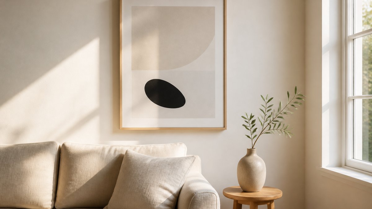
Quick Comparison: 7 Minimalist Prints at a Glance
All seven picks below are framed prints at the same price, so the choice comes down to mood and palette rather than budget. Here is how they compare.
| Artwork | Visual Character | Palette | Best For |
|---|---|---|---|
| Mindful Scene | Clean lines, subtle composition | Soft neutral | Reflection and focus |
| Concentric Zen | Concentric circles | Muted, warm | Geometric balance |
| Zen Stones | Stacked organic stones | Earthy neutral | Grounding spaces |
| Zen Watercolour Stones | Soft watercolour washes | Gentle, light | Spa-like calm |
| Japandi Ripples | Flowing ripple forms | Warm neutral | Japandi interiors |
| Cool Tone Ripples | Ripple forms, cool hues | Blue-grey | Airy, open rooms |
| Calming Hues | Soft blended tones | Subtle multi-tone | Versatile styling |
Every piece in the table is a professionally framed print made to order, available in four sizes and three frame finishes, priced at $33.50. We keep the range tight on purpose: seven pieces that work together are more useful than seventy that do not.

1. Mindful Scene: Best for Reflection and Focus
Our top pick for most rooms is Mindful Scene because it does the hardest job in minimalist art well: it holds a wall without demanding anything from you. The composition is built on clean lines and a subtle, balanced arrangement, which creates a calm visual atmosphere rather than a focal point that shouts.
In practice, this is the piece we recommend for a home office or a reading corner. When you look up from a screen, you want somewhere quiet for your eyes to land. Mindful Scene gives you that without pulling your attention away from the work.
Where it falls short: if you want a piece with obvious movement or a strong colour story, this is not it. It is deliberately understated, and that is the point.
The museum's guidance on how line and space direct attention in art
2. Concentric Zen: Best Geometric Wall Art for Balance
Geometric wall art works when the geometry has a reason to exist, and Concentric Zen earns its circles. The layered concentric forms draw the eye inward rather than across the wall, which creates a natural settling effect in a room.

This is the pick for anyone who wants a clear focal point above a sofa or bed but still wants the room to feel quiet. The circular structure gives the composition order, and order reads as calm.
One honest limitation: concentric circles are a strong shape. In a very small room, a large format version can dominate more than you expect. We would size down rather than skip it.
3. Zen Stones and Zen Watercolour Stones: Best Calming Wall Art for Grounding Spaces
Stacked-stone imagery is the most literal expression of balance in minimalist art, and it works for a simple reason: the composition is stable. Nothing in the image is about to fall.
Zen Stones uses clean organic forms and a restrained palette, which suits a hallway, entryway, or meditation space where you want the wall to feel settled. Zen Watercolour Stones softens the same idea with gentle watercolour tones and fluid brush-like texture. If your room has linen, natural wood, or soft metals, the watercolour version sits into that palette more easily.

A common mistake is hanging stacked-stone art too high. The subject is grounded, so the frame should be too.
4. Japandi Ripples, Cool Tone Ripples, and Minimal Ripples: Best Flowing Minimalist Living Room Art
Ripple-based designs are the best minimalist living room art for rooms that need movement without noise. Soft flowing forms mimic the rhythm of water, which adds gentle visual interest while keeping the overall composition clean.
The three ripple pieces split by temperature and intensity:
- Japandi Ripples blends Japanese serenity with Scandinavian restraint. Warm, balanced, and the safest choice for a Japandi or Scandi interior.
- Cool Tone Ripples uses cooler hues, which makes a room read as more open and airy. Best for smaller living rooms or north-facing spaces that need lifting.
- Minimal Ripples is the most stripped back of the three. If you want the least possible visual detail on the wall, start here.
What most guides miss is that ripple art hangs best in pairs or threes. The forms read as a sequence, so a gallery wall of two or three ripple prints looks intentional rather than repetitive.
5. Calming Hues, Neutral Abstract, and Soft Lines: Best for Versatile Neutral Palettes
If you are not sure what your room needs, start with the neutral group. These three pieces are the most adaptable in the collection because their palettes are built from muted tones rather than a single dominant colour.
Mindful Scene Miniminalist Wall Art →
Calming Hues blends subtle tones into a soft, balanced composition that suits contemporary and Scandinavian interiors. Neutral Abstract takes the same restrained approach with a cleaner abstract structure, which makes it a strong choice for hallways and entryways where the wall is seen in passing. Soft Lines uses gentle flowing linework to create quiet movement, and it is the one we would pick for a workspace.
The real difference between these three comes down to how much structure you want. Soft Lines has the most linear movement, Neutral Abstract sits in the middle, and Calming Hues is the softest of the group.
Design guidance on neutral palettes and visual rest in interiors
How to Choose Wall Art for a Living Room: Sizing, Height, and Layout
The most common sizing rule is that art should span roughly two-thirds to three-quarters of the width of the furniture below it. For a standard three-seat sofa, that means a single large piece or a tight group of two to three smaller ones.
Hanging height matters just as much. The centre of the artwork should sit at roughly eye level, which for most people is around 145 to 150 centimetres from the floor. Above a sofa, leave 15 to 25 centimetres of clear wall between the top of the sofa back and the bottom of the frame.
Layout follows a simple decision path:
- One large piece for a single focal wall, a calm room, or a small apartment where you want impact without clutter.
- A pair for a symmetrical space, a hallway, or above a bed.
- A gallery wall of three to five for a larger wall, keeping one consistent frame finish and a uniform gap of 5 to 8 centimetres between frames.
For a small apartment with awkward wall layouts, a vertical pair works better than a wide row. It uses height instead of width, which is usually the constraint.
Our frames ship with hanging hardware included, so you are not hunting for fixings on the day. For 24 by 36 inch horizontal frames, we recommend placing each mounting hook 2.5 centimetres from the frame corners.
Room-by-Room: The Same Rules, Different Jobs
Most guides stop at the living room. But the wall above a sofa and the wall beside a bed are doing different work, and the sizing logic shifts with them.
Bedroom. The bed is the anchor, so the art should span roughly two-thirds of the headboard width, not the mattress width. Centre it on the headboard, and hang the bottom of the frame 20 to 25 centimetres above the headboard so it clears pillows and reading positions. A single wide piece or a symmetrical pair works best; a gallery wall above a bed tends to feel busy when you are lying under it. For low-arousal bedrooms, favour tone-on-tone palettes and avoid anything with strong diagonal movement.
Home office. You face this wall for hours, so choose the lowest-arousal piece in your taste range. Hang it at seated eye level, roughly 120 to 130 centimetres from the floor, not standing eye level, because you are looking at it from a chair. A single centred piece with generous negative space beats a cluster here. If you take video calls, check that the art does not sit directly behind your head at camera height; a busy print behind a speaker is distracting to everyone on the call.
Entryway. You see this wall in passing, so it can carry more visual interest than a workspace. A vertical pair or a single tall piece suits narrow entry walls. Hang the centre slightly higher than living-room eye level, around 155 to 160 centimetres, because you are usually standing and moving, not sitting. A console table below gives you a natural anchor: leave 15 to 20 centimetres between the tabletop and the bottom of the frame.
Small spaces and awkward walls. In a studio or small apartment, the constraint is usually width, not height. A vertical stack of two or three prints uses the wall you have. For a wall narrower than 90 centimetres, a single piece sized to about 60 to 70 percent of the wall width reads as intentional; anything wider feels cramped. Sloped or angled walls work best with a single piece centred on the widest flat section rather than a group that fights the angle.
Hallways and stairwells. These are transitional, so movement in the art is fine, ripple forms, flowing linework, a sequence of related prints. A row of three works well along a hallway; on a stairwell, follow the diagonal of the stairs with the centres of the frames rather than hanging them in a level line, which looks off against the slope.
A Quick Sizing Reference
| Space | Anchor | Art width | Centre height |
|---|---|---|---|
| Living room | Sofa | 2/3 to 3/4 of sofa width | 145-150 cm |
| Bedroom | Headboard | ~2/3 of headboard width | 145-150 cm (bottom 20-25 cm above headboard) |
| Home office | Desk / seated view | 1/2 to 2/3 of desk width | 120-130 cm (seated eye level) |
| Entryway | Console table | 2/3 of console width | 155-160 cm |
| Narrow wall (<90 cm) | Wall itself | 60-70% of wall width | 145-150 cm |
Layout Rules That Actually Hold Up
- Keep one frame finish across a group. Mixed finishes read as collected-over-time, which is a different look from calm and intentional.
- Uniform gaps beat equal outer margins. A consistent 5 to 8 centimetres between frames looks deliberate; equal spacing from the wall edges rarely does.
- Templates first, nails second. Cut paper to the exact frame size, tape it up, live with it for a day. Moving paper is free.
- Anchor to furniture, not to the ceiling. Art hung too high is the single most common mistake; the gap between furniture and frame should almost always be smaller than the gap between frame and ceiling.
- Light it indirectly. A picture light aimed at the art, or a nearby lamp, beats a ceiling downlight that creates glare on the surface.
Guidance on hanging and displaying artwork safely
Frequently Asked Questions
What colours make wall art feel calming?
Soft neutrals, muted tones, and cool hues tend to read as calming because they lower visual contrast. Neutral Abstract and Calming Hues both use restrained palettes of beige, grey, and soft blue that sit quietly against most wall colours. If your room already has strong colour, a black-and-white or neutral piece gives the eye somewhere to rest without competing with the space.
What size wall art works best above a sofa?
A common guideline is to choose art that spans roughly two-thirds of the sofa's width, leaving 15 to 25 cm of wall visible on each side. For a 24 x 36 inch (61 x 91 cm) horizontal frame, place each mounting hook 2.5 cm from the frame corners. Hang the centre of the artwork 145 to 152 cm from the floor so it sits at eye level.
Can geometric wall art create a calm interior?
Yes. Geometric wall art creates calm when the shapes are soft and the palette is restrained. Concentric Zen uses layered circular forms that draw the eye inward rather than scattering attention, which produces a meditative effect. Sharp, high-contrast geometry tends to energise a room instead, so look for rounded shapes, muted tones, and generous negative space.
How should you arrange minimalist art on a wall?
Start with one anchor piece and build outward. A single large print centred above a sofa or bed is the simplest calm arrangement. For a gallery wall, keep 5 to 8 cm between frames and align the outer edges to a single rectangle. Mixing one horizontal piece with two vertical pieces of similar tone keeps the group cohesive without looking repetitive.
How long does made-to-order framed art take to arrive?
Each LagomDesigns piece is printed and framed after you order, which typically adds a few days before dispatch compared with off-the-shelf prints. If you need a housewarming gift by a specific date, order at least three to four weeks ahead. Every frame ships ready to hang with mounting hardware included, so no extra trip to a framer is needed.


