


Table of Contents
- Start With the Room, Not the Frame
- Should Art Match Furniture? The Honest Answer
- How to Choose Wall Art Colors Using Color Theory
- A Practical Color-Matching Workflow
- Wall Art Color Schemes for Living Rooms
- How to Mix Furniture Colors in a Room Around Your Art
- Lighting, Size, and Framing: The Details That Decide
- Conclusion
- Frequently Asked Questions
Last Updated: October 18, 2026
Start With the Room, Not the Frame
Most people get how to match art to furniture colors backwards: they fall for a print online, then spend weeks forcing it above a sofa it was never meant for.
Start with the room instead. Look at what is already there before you buy anything.
At LagomDesigns, we see this constantly: bold art in a calm, neutral room makes the wall feel loud. The art is fine, the room was never its right home.
So here is the honest answer: art does not have to match your furniture. Below is a repeatable process for choosing wall art that sits in harmony with what you own.

Should Art Match Furniture? The Honest Answer
No, art should not match your furniture exactly. The best wall art repeats one or two colors from the room, then adds a contrasting tone for visual interest. Exact matching looks flat and staged; thoughtful coordination looks collected and calm.

Why Identical Colors Fall Flat
A cohesive look does not come from copying. Beige sofa, beige walls, beige art: the room reads as one flat note, with no contrast, depth, or visual balance. Art is the easiest place to add a second voice, repeat a color, then push gently in a new direction.
Repeat, Don't Copy
Repeating colors separates a designed room from a decorated one. Pull one or two tones from the space and echo them in the art, a terracotta cushion, a terracotta line in a print, a terracotta vase. That is a color palette working together; the art need not be identical, just speak the same language.
How to Choose Wall Art Colors Using Color Theory
Color theory gives you simple rules for pairing art with furniture: complementary colors for energy, analogous colors for calm, contrasting tones for balance. Here is the practical version, with palettes you can actually use.
Complementary and Contrasting Tones
Complementary colors sit opposite each other on the wheel: blue and orange, green and terracotta, yellow and violet. These pairs create energy, a calm room with a navy sofa can handle a warm terracotta or rust print. Contrasting tones do similar work with less intensity: soft cream against deep charcoal adds depth without shouting. Use one strong contrast per room; more feels busy.
Balancing Warm and Cool Tones
Warm tones pull a room inward and feel cozy: terracotta, mustard, rust, warm beige, cream. Cool tones open it up: blue, sage, gray-green, cool white, charcoal. If your furniture leans warm, a cool-toned print balances it; if the room feels cold, warm accent colors soften it. Most rooms go wrong stacking warm on warm until heavy, or cool on cool until clinical, let the art carry the opposite temperature.
Furniture-Specific Palettes You Can Copy
These pairings turn the theory into starting points.
- Gray sofa or gray walls: Gray is a cool neutral, so warm it up with terracotta, rust, mustard, or warm wood tones. A thin oak frame keeps the room from feeling chilly. If the gray is warm (greige), lean into sage and cream instead.
- Beige or cream sofa: Beige is the most forgiving base. Add depth with deep navy or charcoal, or keep it soft with sage and dusty blue. A black frame gives a crisp edge; a wood frame keeps it relaxed.
- Navy sofa: Navy is a strong cool tone. Complement it with warm orange, rust, or mustard, or stay tonal with soft blue and cream. Avoid matching navy exactly; a lighter blue or warm contrast reads as intentional.
- Green sofa (sage, olive, or emerald): Green pairs naturally with terracotta, blush, and warm cream. For calm, use tonal greens with a wood frame; for energy, add a muted pink or rust accent.
A Simple Swatch Method
A paint-store swatch book and a few minutes in the room will do.
- Pull three to five paint chips that match your sofa, rug, and walls.
- Add two chips in the direction you want to go: one complement and one contrast.
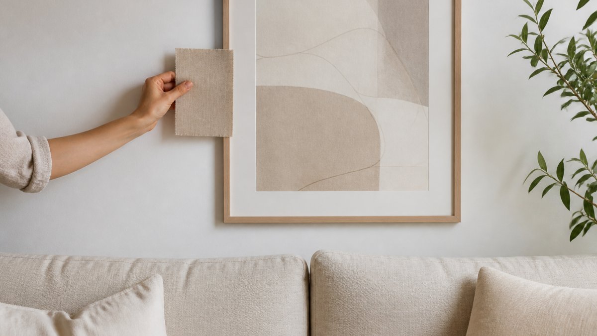
- Hold the chips against the wall where the art will hang, at the same height, in daylight.
- Narrow to one repeat color and one contrast color. That is your art palette.
Two colors are usually enough; a third belongs in the accessories, not the art.
A Practical Color-Matching Workflow
Step 2: List the three biggest colors. Usually the sofa, the rug, and the walls.
Step 3: Pick one or two to repeat. Choose the colors you actually like seeing.
Step 4: Choose a contrast. Add one complementary color or a light-versus-dark shift.
Step 6: Check the light. Colors shift between morning and evening.
Step 7: Commit. Once the palette works in daylight, stop second-guessing.
| Step | Action | Time | Why It Matters |
|---|---|---|---|
| 1 | Photograph the room | 5 min | Captures true colors |
| 2 | List three big colors | 10 min | Sets your grounding tones |
| 3 | Pick one or two to repeat | 5 min | Builds cohesion |
| 4 | Choose one contrast | 10 min | Adds visual interest |
| 5 | Test swatches in daylight | 20 min | Prevents clash |
| 6 | Check evening light | 10 min | Confirms the match |
| 7 | Make the decision | 5 min | Ends the loop |
Wall Art Color Schemes for Living Rooms
A living room is the hardest room to get right because it does the most work. The wall art color schemes for living rooms below cover the most common furniture setups, with a concrete palette for each.
Neutral Sofa, Neutral Art, Warm Accents
This is the calmest, most forgiving route. A neutral sofa and neutral wall art give you a quiet base.
Then warm accent colors do the talking. A terracotta throw, a brass lamp, a warm wood frame. The room stays serene but never flat.
Neutral Abstract Canvas Wall Art →
Our Neutral Abstract Canvas Wall Art is built for exactly this setup. Its soft beige and earth-tone palette blends into Scandinavian and minimalist interiors without competing for attention.
Bold Furniture, Quiet Art
When the furniture is loud, the art should whisper. A deep green sofa or patterned rug already carries the room's energy, so choose quiet, neutral art. Let the furniture be the focal point and use the art to give the eye somewhere to rest, that contrast is what makes bold furniture work. Without it, everything shouts at once.
Palettes for Common Living Room Furniture Colors
Use these as starting points, then adjust to your light and taste.
- Gray sofa: Warm it with terracotta, rust, or mustard; keep it calm with sage and cream. A thin oak frame softens cool gray.
- Beige sofa: Add depth with navy or charcoal, or stay soft with sage and dusty blue. Black frame for a crisp edge, wood frame for relaxed.
- Navy sofa: Complement with rust, mustard, or warm orange; go tonal with soft blue and cream. Avoid matching navy exactly.
- Green sofa: Pair with terracotta, blush, or warm cream; go tonal with sage and olive. Wood frame keeps it natural.
- Wood-heavy room (oak, walnut, teak): Cool oak with sage or blue; contrast walnut with cream or pale blue; balance teak with green or blue.
A Quick Visual Test Before You Buy
Color schemes look different on a screen than on your wall. Before you commit:
- Print a small color copy of the artwork, or tape a paint chip in its place.
- Leave it on the wall for a full day, checking morning, afternoon, and evening light.
- Step back to sofa distance and squint. If the art disappears into the furniture, add contrast; if it shouts, soften the palette.
This low-cost preview catches most mismatches before you spend money and works in rentals where you cannot repaint.
How to Mix Furniture Colors in a Room Around Your Art
How to mix furniture colors in a room gets easier when the art leads.
A few practical moves:
- Repeat one art color in a rug or cushion
- Match the frame finish to a metal or wood already in the room
- Use the art's materials and finishes to guide hardware choices
- Keep design motifs consistent without copying them
This is color coordination at its most useful: you are not matching pieces to each other, but matching them all to one anchor.
Our Neutral Tones Earthy Minimalism Wall Art works well as that anchor. Its earthy palette lets you pull warm and cool tones into the room around it.
Lighting, Size, and Framing: The Details That Decide
Color is only half the story. Lighting, size, and framing decide whether a piece actually works.
Size matters relative to furniture. Art should span roughly two-thirds the width of the furniture below it.
Framing ties it together. A wood frame echoes wood furniture; a black frame adds a crisp, contemporary edge.
Hang art so its center sits near eye level, and keep it close enough to the furniture to feel connected.
Conclusion
Matching art to furniture is not about finding an exact color twin.
The hard part is trusting that a calm, related palette will feel better than a perfect match. It almost always does.
That is where LagomDesigns helps. Our framed minimalist prints come in four sizes and three frame finishes, professionally framed and ready to hang.
Search our store to find the piece that brings your room into balance.
Frequently Asked Questions
Should wall art match your furniture exactly?
No. Identical colors between art and furniture tend to flatten a room because nothing stands out. The stronger approach is to repeat one or two colors already present in the space, then add a complementary or contrasting tone for visual interest. A beige sofa with a terracotta cushion, for example, pairs well with art that carries a hint of terracotta plus a cooler neutral. The goal is harmony, not duplication, so the artwork reads as part of the room rather than a copy of the sofa.
How do you choose art for a room with neutral furniture?
Neutral furniture gives you the most freedom. Pull one grounding tone from the room, such as the cream of your walls or the warm grey of a rug, and let the art echo it softly. Then decide whether you want calm or contrast: a neutral abstract print keeps the mood quiet, while a piece with a deeper accent color adds a focal point. Check the art in the same light as the room before committing, since warm bulbs and cool daylight shift how beige and grey read on a wall.
Can artwork be a different color from the furniture?
Yes, and it often should be. Artwork that introduces a new color, used sparingly, gives the eye somewhere to land and makes a neutral room feel considered rather than flat. The trick is to connect it back to the room through a secondary element: a cushion, a rug, a vase, or a frame finish that ties the new tone to something already there. Keep the new color to one or two pieces so the space still feels cohesive and calm rather than busy.
How can you preview different art colors in a room before buying?
Start with a physical swatch or a printed color sample taped to the wall at the height you plan to hang the piece, then look at it at three times of day. Screens distort color, so a printed preview is more reliable than a product photo. Masking tape can outline the intended size so you can judge scale against the sofa or sideboard. If you are ordering framed prints, check the return policy first so a color that clashes in person can be exchanged without stress.


