


Last Updated: October 25, 2026
Quick Summary
The best minimalist art for home offices uses few colors, open space and simple forms so the wall settles the room instead of competing with your work. Choose open abstract pieces for deep focus, low-contrast art for video calls, and neutral tones that match decor you cannot change. Size one framed print to roughly half to two-thirds of the desk width and hang it at seated eye level.
- Minimalist art uses few colors, open space and simple forms to remove visual clutter.
- Space for Thinking is the top pick for focus-led desks at $33.50.
- Blue Curves and Calming Hues keep video-call backdrops quiet with low contrast.
- Keep 15-20 cm of clear wall below the frame so the desk does not feel cramped.
- Frames are Ayous wood 0.75 inch thick with 189 g/m² matte paper from Japan.
Table of Contents
- Why Minimalist Art Belongs in a Home Office
- Quick Comparison: Best Minimalist Art for Home Offices
- 1. Space for Thinking: The Best Pick for Focus-Led Desks
- 2. Simple Lines and Blue Curves: Geometric Wall Art That Stays Quiet
- 3. Neutral Office Wall Art: Beige Architecture and Neutral Shapes
- 4. Small Home Office Wall Art: Sizing, Placement and Video-Call Angles
- How to Choose Art by Work Style and Sensory Needs
- Frames, Materials and What Your Money Actually Buys
- Start With One Calm Wall
- Frequently Asked Questions
Why Minimalist Art Belongs in a Home Office
Most home offices fail at the same thing: the wall behind the desk competes with the work. A busy gallery of prints, a bold slogan, a photo collage, and suddenly every video call starts with visual noise.
Minimalist art is wall decor built from restraint. It uses few colors, open space, and simple forms, and it deliberately removes visual clutter so the eye has somewhere quiet to rest. That matters in a workspace.
The practical case is simple. Neutral tones and clean compositions blend into almost any office design, from a Scandinavian desk setup to a plain rental corner. They also age well. A line drawing or a soft abstract does not date the way a trend-led poster does.
Below, we rank our picks by work style, then cover sizing, placement, framing, and what your money actually buys.
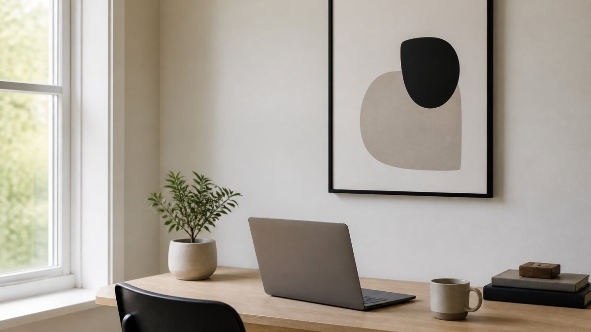
Quick Comparison: Best Minimalist Art for Home Offices
Here is the short version, ranked for a focus-led workspace.
| Pick | Piece | Price | Best For | Style |
|---|---|---|---|---|
| 1 | Space for Thinking | $33.50 | Focus-led desks | Abstract, open space |
| 2 | Blue Curves | $33.50 | Video-call backdrops | Flowing line art |
| 3 | Beige Architecture | $33.50 | Neutral rooms | Architectural, beige |
| 4 | Neutral Shapes | $33.50 | Small offices | Geometric, neutral |
| 5 | Shape and Shadow | $39.50 | Creative studios | Geometric contrast |
Every piece is a framed poster, made to order, and available in four sizes and three frame finishes. For a wider set of serene options beyond this list, our roundup of calm minimalist picks covers more rooms and palettes.
1. Space for Thinking: The Best Pick for Focus-Led Desks
If your desk faces a wall and your job needs concentration, start here. Space for Thinking is built around open visual space, and that emptiness is the point. It removes visual noise so the wall stops asking for attention.
The composition is abstract and balanced, which keeps it calm at close range, exactly where you sit. It suits a productive workspace, a study room, or a creative corner where you need a clear head more than a statement.
It ships as a framed poster with an Ayous wood frame, 0.75 inch thick, matte paper at 189 g/m², an Acrylite front protector, and hanging hardware included. Made to order, so allow production time before it arrives.
Best for: anyone whose work depends on sustained focus. Skip if: you want a bold focal point that starts conversations.
You can view the Space for Thinking print and check the sizes before you commit.

2. Simple Lines and Blue Curves: Geometric Wall Art That Stays Quiet
For a wall that appears on camera, geometric wall art with soft curves is the safer choice. Blue Curves uses flowing lines in muted blue tones, so it adds movement without adding clutter. On a video call, that reads as composed rather than busy.
The same logic applies to Simple Lines, which strips the idea down to clean line art. Both work in a minimalist decor scheme and both hold up beside a monitor, a shelf, and a lamp without fighting them.
One honest limitation: blue reads cooler on screen than in a warm room. If your walls are cream or your lighting is warm, the tone will shift slightly.
Best for: renters and remote workers who sit on camera daily. Skip if: your office already has strong color and you need a neutral anchor.
You can see the Blue Curves geometric piece in each frame finish.

3. Neutral Office Wall Art: Beige Architecture and Neutral Shapes
Neutral office wall art solves the most common home-office problem: matching art to decor you cannot change. Beige Architecture uses soft beige tones and clean structural lines, so it sits easily against white, greige, oak, or pale grey walls.
Neutral Shapes takes the same approach with abstract geometric forms in soft tones. Both pieces anchor a neutral color scheme without going flat. The architectural lines give the eye structure; the neutral palette keeps the room calm.
Both are framed posters at $33.50, made to order from Ayous wood and museum-quality matte paper sourced from Japan. If you want the beige piece specifically, you can shop the Beige Architecture print.
Space for Thinking Minimalist Wall Art →

Best for: neutral rooms and anyone styling around existing furniture. Skip if: you want strong contrast against a dark wall.
4. Small Home Office Wall Art: Sizing, Placement and Video-Call Angles
Small home office wall art works when the piece is sized to the wall, not to the room. A single framed print above a desk is usually enough. Measure the wall width, then keep the frame to roughly half to two-thirds of the desk width so it feels anchored rather than floating.
Placement rules that hold up in practice:
- Hang the center of the frame at eye level when seated, so it sits in your video-call frame without cropping.
- Keep 15-20 cm of clear wall below the frame so the desk does not feel cramped.
- On a narrow wall, go vertical. On a wide wall above a desk, horizontal orientation balances the desk line.
- For a gallery wall, start with one anchor piece and add two smaller prints, keeping 5-8 cm between frames.
For 24 x 36 inch horizontal frames, place each mounting hook 2.5 cm from the frame corners. That single detail prevents the sag most people get wrong on wide frames.
Watch out: hanging art directly behind your monitor puts a bright rectangle in the camera's center. Offset it to the side instead.
How to Choose Art by Work Style and Sensory Needs
Match the art to how you work, not to the trend. This is the step most guides skip, and it is where a minimalist office wall earns its keep.
- Deep-focus work: choose open, abstract pieces with lots of negative space, like Space for Thinking or Concentric Zen. The mechanism is simple: fewer edges, fewer colors, and more empty space give the eye fewer places to land, which reduces the pull on attention when you glance up.
- Creative work: geometric contrast helps. Shape and Shadow adds depth without complexity, and a piece with one strong shape gives the eye a resting point rather than a puzzle.
- Client-facing calls: pick calm, low-contrast pieces. Blue Curves and Calming Hues keep the backdrop quiet, and low-contrast art reads as composed on a compressed video stream where fine detail turns to noise.
- Sensory sensitivity: avoid high-contrast patterns and dense detail. Soft tones and simple forms reduce visual load. A useful rule is to keep the number of distinct colors in the piece low, and to prefer matte paper over glossy finishes that reflect light and create glare.
- Shared or hybrid desks: neutral pieces travel better between rooms and setups. A beige or soft-grey piece is less likely to clash when you move desks or change lighting.
A useful test: look at the piece for ten seconds, then look away. If you can still picture the shapes clearly, it is probably too busy for a workspace. A calmer piece leaves an impression of tone rather than a detailed image.
Accessibility and legibility: If you use screen magnification or sit close to the wall, contrast matters more than style. A piece with a clear figure-ground relationship, where the main shape stands out from the background, is easier to read at a glance than a low-contrast wash.
A note on productivity claims: No piece of art will make you more productive on its own. What a calm wall can do is remove one source of visual competition, which most practitioners find helps them settle into work faster. Treat the wall as part of the room's sensory environment, not as a motivational poster.
Frames, Materials and What Your Money Actually Buys
Price differences in framed prints come down to three things: the frame, the paper, and whether it arrives ready to hang.
Our frames are Ayous wood, 0.75 inch thick, from renewable forests. The matte paper is 189 g/m² and 10.3 mil thick, sourced from Japan, with an Acrylite front protector and hanging hardware included. Each piece is made to order, which reduces overproduction and waste.
That combination is what separates a print that lasts from one that warps or fades. If you already own unframed prints, read our guide on how to frame art prints professionally before you buy anything else.
Watch out: cheap frames often use thin acrylic that scratches in transit and paper that yellows near a window. Check the paper weight before you compare prices.
Start With One Calm Wall
The hardest part of styling a home office is stopping. One well-chosen piece does more for a workspace than five that compete for attention. Pick the piece that matches your work style, size it to the wall, and hang it at seated eye level.
LagomDesigns makes framed minimalist prints to order, in four sizes and three frame finishes, with museum-quality matte paper and hardware included so each piece arrives ready to hang. Every design works alone or as part of a gallery wall, and the collection is priced to leave room for the second piece.
Get started with LagomDesigns and give your workspace the quiet backdrop it has been missing.
Frequently Asked Questions
What kind of art is best for a home office?
Art with low visual noise works best: abstract compositions, line drawings and soft geometric forms that leave open space on the wall. The goal is a piece you can look past while working and look at when you pause. Minimalist art suits this because it removes the detail that pulls your eye away from the screen. Pieces like Space for Thinking are built around that idea, with a clean composition designed for focus-led rooms.
What colors are best for a productive home office?
Neutral tones, soft beige and muted blues are the safest choices. They sit quietly against most wall colors and do not compete with your desk, monitor or lighting. A neutral color scheme also makes it easier to add a second piece later without clashing. If your office already has strong color, keep the art pale; if the room is all white and grey, a soft blue like Mindful in Blue adds calm without turning the wall into a focal point.
How do you choose the right size art for an office wall?
Match the art to the furniture below it rather than the whole wall. A framed print should span roughly half to two-thirds of the width of the desk or console it hangs above. Above a standard desk, a 24 by 36 inch horizontal frame is a reliable starting point. On a narrow wall or in a small home office, a single smaller piece centered at eye level beats a crowded arrangement.
Is minimalist art good for a workspace?
Yes, for most people. Minimalist art reduces the number of things competing for attention in your field of view, which helps in a room where you already have a monitor, cables and paperwork. The trade-off is that a very sparse wall can feel cold. One larger piece with warm neutral tones, or a two-piece pairing, keeps the room calm without making it feel empty.
How do you style wall art above a desk?
Center the frame on the desk, not on the wall, and hang it so the middle of the artwork sits at roughly eye level when you are seated. Leave at least 15 to 25 cm between the bottom of the frame and the desk surface so the piece has room to breathe. For a 24 by 36 inch horizontal frame, place each mounting hook about 2.5 cm in from the frame corners.


