


Last Updated: November 17, 2026
Quick Summary
Modern minimalist wall art for bedrooms gives the eye somewhere to rest, using one calm piece or a tight set of three instead of a busy gallery. Above a bed, choose art spanning roughly two-thirds to three-quarters of the furniture width below it. Keep frames out of direct sunlight to slow fading.
- Measure the bed or dresser first, then choose art to match it.
- A common gap between triptych frames is around 5 to 8 cm.
- Hang the center of a three-frame group roughly 145 cm from the floor.
- Center art above a bed on the mattress, not the wall.
- Framed pieces use Ayous wood 0.75 inches thick with 189 g/m² matte paper.
Table of Contents
- Why Modern Minimalist Wall Art for Bedrooms Changes the Room
- Large Modern Minimalist Wall Art for Bedrooms: When Scale Does the Work
- Small Modern Minimalist Wall Art for Bedrooms: Filling Awkward Walls Without Clutter
- Minimalist Wall Art Black and White: The High-Contrast Route
- Minimalist Wall Art Set of 3: Building a Balanced Gallery Wall
- Matching Art to Bedroom Size, Wall Dimensions, and Color
- Framing, Materials, and Care: What Lasts
- Shop the LagomDesigns Bedroom Collection
- Frequently Asked Questions
Why Modern Minimalist Wall Art for Bedrooms Changes the Room
Modern minimalist wall art for bedrooms works because it gives the eye somewhere to rest. A single calm piece above the bed, a pair of quiet prints on a narrow wall, or one large abstract in soft neutral tones does more for a bedroom than a busy gallery ever will. Framed minimalist prints work around exactly this idea: one considered piece, nothing competing for attention.
The bedroom is where visual quiet matters most. You see the same wall first thing every morning and last thing every night, and loud color and dense pattern create a low hum of visual noise you stop noticing but never stop feeling.
The Calm-First Case for Less on the Wall
A calm bedroom starts with fewer decisions on the wall, not more. One large piece or a tight set of three reads as intentional. Twelve small frames read as clutter, even when each one is beautiful on its own.
Here is the trade-off most people miss: minimalist art is not "less decorating." It is harder decorating. Every proportion, color, and frame finish is visible because nothing hides behind noise. That is also why it works so well.
Large Modern Minimalist Wall Art for Bedrooms: When Scale Does the Work
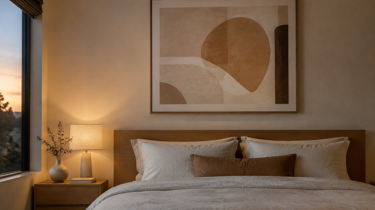
Large modern minimalist wall art for bedrooms is the right call when you have one generous wall and no desire to build a gallery. A single big piece anchors the room, and scale does the decorating for you.
Size is where most people undershoot. A print that looks substantial on a screen can look like a postage stamp above a king bed.
Watch out: measuring the wall but not the furniture. Measure the bed or dresser first, then choose the art to match it.
Small Modern Minimalist Wall Art for Bedrooms: Filling Awkward Walls Without Clutter
Small modern minimalist wall art for bedrooms solves a specific problem: the narrow strip beside a wardrobe, the wall between two doors, the sloped attic corner. These spaces punish big art and reward restraint.
The mistake here is scaling up to fill space that was never meant to hold a large piece. A slim vertical print or a small square centered on a narrow wall looks deliberate.
Small does not mean forgettable. A single piece like Cairn, with its stacked-stone composition, brings a grounding, mindful quality to a tight corner.
Best for: small apartments, attic rooms, and any wall under about a metre wide. Skip if: the wall is a full headboard wall, where a small piece will look lost.
Minimalist Wall Art Black and White: The High-Contrast Route
Minimalist wall art black and white is the sharpest version of the style.
It suits rooms that already have strong color elsewhere, a deep green wall, a rust linen duvet, a dark timber bed, giving them a clean counterpoint instead of another competing hue.
The risk is coldness. A black and white bedroom can tip from calm into clinical if every surface is hard and bright. Warm it with texture: a wool throw, a linen headboard, a rattan pendant.
If you want the graphic discipline of black and white but a gentler feel, a high-contrast neutral piece like Threshold sits between the two, with strong abstract structure in soft neutral tones.
Minimalist Wall Art Set of 3: Building a Balanced Gallery Wall
Minimalist wall art set of 3 is the middle path between one large piece and a full gallery. Three frames give you rhythm and balance without the busyness of a larger arrangement, and in a bedroom they are the most forgiving way to fill a wide headboard wall that would swallow a single small print.
The rule that makes a triptych work: treat the three frames as one shape. Space them evenly, keep the gaps narrow, and align the outer edges so the group reads as a single unit. A common gap is around 5 to 8 cm between frames, and the center of the group should hang at eye level, roughly 145 cm from the floor.
Three Layouts That Work in a Bedroom
The same three frames can be arranged three ways, and the choice should follow the wall rather than the furniture catalogue.
- Horizontal triptych (1 row of 3): the default above a bed. Best when the wall is wider than it is tall and the headboard is low. Keep the three frames the same size and orientation so the row reads as one wide band.
- Vertical stack (3 in a column): best for narrow walls beside a wardrobe or between two doors, where a horizontal row would crowd the edges. Use portrait-oriented pieces and keep the stack centered on the bed or dresser below.
- Salon-style trio (1 large, 2 small): a large central piece with two smaller frames flanking it at the same center line. This suits a wall where you want a focal point but not a full gallery.
Curated Bedroom Combinations
A set works best when the three pieces are chosen as a family, not assembled one at a time. Three tonal strategies cover most bedrooms:
- Same family, three tones: one light, one mid, one dark piece in the same neutral palette. This is the safest combination and reads most clearly as a single composition. In our collection, Steady State, Sandstone, and Echo sit together this way.
- One anchor plus two supports: a larger or higher-contrast piece in the center, with two quieter pieces flanking it. Use this when the bed wall is the room's focal point and you want the eye to land in the middle.
- Monochrome set: three black and white or high-contrast neutral pieces. This is the sharpest option and suits rooms with strong color elsewhere, but it needs texture nearby to keep the wall from feeling clinical.
Watch out: buying three prints in three different palettes because each one looks good alone. A set is judged as a group, so the weakest pairing drags down the whole wall.
If you want the full step-by-step for spacing and layout, our guide on how to arrange minimalist gallery walls walks through the measuring and hanging order.
Matching Art to Bedroom Size, Wall Dimensions, and Color
Matching art to a bedroom comes down to three numbers and one palette: bed width, wall width, and hanging height, plus the colors already in the room. Get those right and almost any piece will settle in.
Start with the bed. Art above a bed should be centered on the mattress, not the wall, since the two are rarely aligned. Then check the ceiling: art hung too high floats, and art hung too low crowds the pillows.
For the palette, pull one or two colors from what is already there. A blue-grey duvet pairs naturally with Deep Breath. If you are working with a stronger wall color, our guide to choosing art for neutral rooms covers the calmer combinations step by step.
Coordinating With Bedding, Paint, and Lighting
Lighting changes how art reads more than most people expect. A north-facing bedroom washes color cooler, so warm neutrals like Steady State hold their softness better than cool greys. A south-facing room with strong afternoon light can take a slightly deeper tone without going heavy.
Match the frame finish to the room's metal and wood, not to the print. Black frames sharpen a space and suit black and white work. Natural wood frames soften and suit earthy palettes. Keep one finish across a set, and if you mix, keep it to two.
Framing, Materials, and Care: What Lasts
Framing and materials decide whether a print still looks good in five years. A thin frame warps, cheap paper yellows, and plastic glazing scratches. Good materials cost a little more and quietly outlast the trend that made you buy.
Our framed pieces are professionally framed in Ayous wood 0.75″ (1.9 cm) thick, with a matte paper weight of 189 g/m², an Acrylite front protector, and hanging hardware included. If you are weighing up what separates a print that lasts from one that does not, our comparison of high quality vs cheap wall art breaks down the materials, and the benefits of premium framed art prints explains why the difference shows up over time.
Choosing Between Print, Canvas, and Framed Options
The right material depends on the wall, the light, and how much texture you want in the room. A few working rules:
- Framed matte print: a framed option with matte paper, suited to bedrooms and calm spaces.
Frame Finish and Glazing
Match the frame finish to the room's metal and wood, not to the print. Black frames sharpen a space and suit black and white work. Natural wood frames soften and suit earthy palettes. Keep one finish across a set, and if you mix, keep it to two.
Glazing matters more in a bedroom than most rooms because of morning light. Keep frames out of direct sunlight to slow fading.
Care That Actually Protects the Art
Dust with a dry cloth, keep frames out of direct sunlight, and avoid spraying cleaner directly onto the glazing.
| Material | Best For | Trade-off |
|---|---|---|
| Framed matte print | Bedrooms, calm neutral spaces | Needs dusting and shade from direct sun |
| Unframed print | Budget setups, DIY framing | You supply the frame and hanging hardware |
| Canvas | Texture-led, softer rooms | Less crisp for fine line work; collects dust |
| Metal | Modern, high-contrast rooms | Reflects light, can feel cold in a bedroom |
Shop the LagomDesigns Bedroom Collection
Our framed collection is built around one idea: art that calms rather than competes. Each piece is made to order and arrives ready to hang.
Start with the piece that matches your room's dominant tone. Cool rooms suit Deep Breath and its soft blue minimalism. Warm rooms suit Sandstone and Threshold. If you are still narrowing it down, our roundup of the best minimalist art for calm living shortlists seven pieces by mood.
Most bedroom walls fail for the same reason: too many pieces, too small, hung too high. Fix the scale and the palette, and the room settles almost immediately.
Frequently Asked Questions
What kind of wall art is best for a bedroom?
Calm, low-contrast pieces work best: soft abstract designs, gentle botanical prints, and neutral-toned minimalist wall art. Avoid busy compositions or high-contrast photography that competes with rest. LagomDesigns pieces like Steady State and Sandstone use soft, calming color palettes. Size matters too: a single piece roughly two-thirds the width of the bed or headboard anchors the wall without overwhelming it.
How do I choose the right size wall art for a bedroom?
Measure the wall width behind your bed, then aim for art that covers about 50 to 75 percent of that span.
Where should wall art be placed above a bed?
Hang the bottom of the frame 15 to 25 cm above the headboard, and center it on the bed rather than the wall. For a 24 x 36 inch horizontal frame, place each mounting hook 1 inch (2.5 cm) from the frame corners.
How can I style a minimalist gallery wall in a bedroom?
Start with one anchor piece, then build outward with smaller frames in the same palette. Keep spacing consistent and don't fill every gap. LagomDesigns frames include hanging hardware, so you can lay the arrangement out on the floor first, then transfer it to the wall.


