


Last Updated: November 2, 2026
Quick Summary
To choose art for neutral rooms, first read your room's undertones as warm, cool, or mixed, then decide whether the art should match, complement, or contrast your palette. Size the piece to roughly 60 to 75 percent of the wall width above furniture, and test it at home before hanging.
- Spend ten minutes studying your room's undertones before spending any money on artwork.
- Match keeps a room calm, complement adds gentle interest, and contrast creates a focal point.
- Above a sofa, art should span about two-thirds of the sofa's width.
- Hang art with its center about 145 to 150 cm from the floor.
- Tape a paper template the exact size of the piece to the wall and live with it for a day.
Table of Contents
- Start With the Room, Not the Art
- A Color Framework for Neutral Rooms
- Why Neutral Abstract Wall Art Works in Quiet Interiors
- Use the Wall Art Size Guide to Get Scale Right
- One Large Piece or a Gallery Wall?
- How to Hang Wall Art Without Guessing
- Test the Piece at Home Before It Goes Up
- Choose Your Piece and Hang It This Week
- Frequently Asked Questions
Start With the Room, Not the Art
Most people buy art backwards. They fall for a piece online, hang it, then wonder why the room feels off. The room should pick the art, not the other way around.
Learning how to choose art for neutral rooms starts with reading what is already on your walls, floors, and furniture.
Here is the fix: spend ten minutes studying your room before you spend a cent on artwork.
Read the Undertones Before You Shop
Undertones are the quiet colors hiding inside a "neutral" surface. A beige wall can lean yellow, pink, or gray. Oak flooring pulls warm. A gray sofa may carry a blue or green cast.
Art that clashes on undertone looks wrong even when the main colors match.
Check three surfaces in daylight:
- Hold a plain white sheet of paper against the wall. Does the wall look warmer or cooler than the paper?
- Compare your flooring to the paper. Warm wood leans yellow or red. Cool tile leans blue or gray.
- Look at your largest furniture piece. Note whether it feels warm or cool next to the paper.
Write down what you find. Warm, cool, or mixed. That single note guides every choice that follows.
A Color Framework for Neutral Rooms
Match, complement, or contrast is the simplest framework for picking art in a neutral room. Match means echoing the room's colors. Complement means adding a related tone. Contrast means introducing a deliberate jolt. Each creates a different mood, and none is wrong.
Neutral rooms give you a blank canvas, so your job is deciding how much energy the art should bring.
Match, Complement, or Contrast
Match keeps everything calm. Choose art in the same family as your walls and furniture: beige, cream, soft gray, warm taupe.
Complement adds gentle interest. Pick a color next to your room's tone on the color wheel. Warm beige walls pair well with soft terracotta or muted olive.
Contrast creates a focal point. Drop one strong accent into the neutral palette: a deep navy, a charcoal black, a burnt rust.
Apply the Framework to Warm, Cool, and Greige Palettes
Match the framework to the undertone you identified above. Here is how each approach plays out across the three most common neutral palettes.
Warm neutral palette (cream, beige, warm taupe, oak, brass):
- Match: art in cream, sand, warm gray, or soft camel. Think a tonal abstract with beige and ivory fields.
- Complement: art with muted terracotta, olive, mustard, or rust. These sit next to warm beige on the color wheel and feel related.
- Contrast: a deep navy, forest green, or charcoal piece. Navy against warm beige is a classic high-contrast pairing that still feels sophisticated.
Cool neutral palette (gray, blue-gray, cool white, marble, chrome):
- Match: art in soft gray, dove white, or pale blue-gray. A tonal gray abstract keeps the room serene.
- Complement: art with dusty blue, sage, lavender, or muted teal. These read as cousins to cool gray.
- Contrast: a warm accent, burnt orange, ochre, or warm rust, creates a deliberate jolt against cool gray. Use one piece, not a gallery wall, so the contrast stays intentional.
Greige palette (the gray-beige hybrid that dominates modern interiors):
- Match: art in greige, taupe, mushroom, or soft stone. This is the safest choice and keeps the room cohesive.
- Complement: art with muted sage, dusty rose, or soft blue. Greige sits between warm and cool, so it accepts both directions.
- Contrast: a deep espresso, black, or muted burgundy piece. Greige rooms often lack depth, and a dark contrast piece adds it without introducing a loud color.
A Quick Test for Any Piece
Before you commit, hold a color sample of the art against your wall, your largest furniture piece, and your floor in daylight. Ask three questions:
- Does the art's dominant tone sit in the same warm/cool family as the room? If not, is the mismatch deliberate (contrast) or accidental (clash)?
- Does the art introduce a color you already have somewhere in the room, a throw pillow, a book spine, a plant pot? If yes, it will feel connected.
- Does the art add at least one thing the room lacks, depth, lightness, or a focal accent? If it repeats everything already there, it may disappear.
Want to go deeper on pairing tones with your furniture? Our guide on how to match art to furniture colors walks through each approach with examples.
Why Neutral Abstract Wall Art Works in Quiet Interiors
Neutral abstract wall art is artwork built from soft shapes and muted earth tones rather than recognizable scenes.
A landscape or portrait asks the eye to read a subject.
Texture matters here too. A canvas with visible weave and soft tonal shifts gives the wall something to catch the light.
This is where our own collection fits naturally. Browse our neutral abstract canvas wall art to find soft beige, cream, and earth-tone pieces for your space. Our neutral abstract canvas wall art uses soft beige, cream, and earth-tone hues, with a fade-resistant print.

Best for: living rooms, bedrooms, and home offices that need warmth without noise. Skip if: you want a bold, high-energy focal point.
Use the Wall Art Size Guide to Get Scale Right
The wall art size guide rule: art should cover roughly 60 to 75 percent of the wall width above a piece of furniture. Too small and the art floats. Too large and it crowds the room.
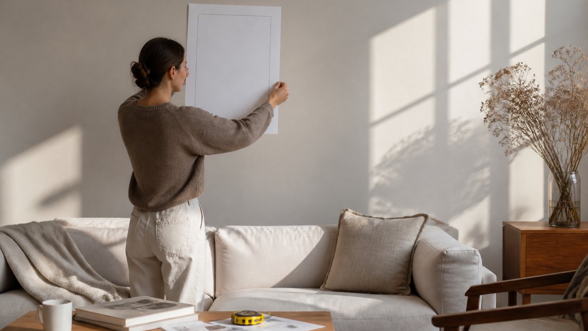
Here are measurable rules you can apply today:
- Above a sofa: art should span about two-thirds of the sofa's width.
- Above a bed: a single piece should be roughly the width of the headboard, or slightly wider.
- On an empty wall: leave at least 15 cm of breathing room on each side.
Worked Examples for Common Furniture Sizes
Here is what the two-thirds rule produces for standard furniture widths.
Neutral Abstract Canvas Wall Art →
Above a sofa:
- 180 cm (about 71 in) sofa: target art width of 120-135 cm. A single 100 × 140 cm piece or a two-piece set totaling about 120 cm works.
- 210 cm (about 83 in) sofa: target art width of 140-158 cm. A single 120 × 160 cm piece or a three-piece gallery spanning about 150 cm fits.
- 240 cm (about 94 in) sofa: target art width of 160-180 cm. A large single piece of 140 × 180 cm or a gallery wall of three to five pieces totaling 160-180 cm.
Above a bed:
- Queen bed (about 152 cm wide): a single piece 100-120 cm wide, or two pieces totaling about 120 cm.
- King bed (about 193 cm wide): a single piece 120-150 cm wide, or a diptych totaling 140-160 cm.
On an empty wall:
- For a wall 200 cm wide, a single piece of 120-150 cm leaves 25-40 cm on each side, within the breathing-room rule.
- For a narrow wall under 100 cm, choose one piece no wider than 70 cm, or skip art and use a mirror or shelf instead.
Gallery Wall Sizing
For a gallery wall, treat the whole arrangement as one shape. Measure the total width and height, then check it against the same rules.
Small apartment with an odd wall? Measure the usable wall first, then build the arrangement to fit it. A 120 cm wall can hold a single 80 cm piece with 20 cm on each side, better than a cramped gallery that ignores the edges.
Here are the measurable sizing rules the article gives for common furniture widths.
| Placement | Furniture width | Target art width |
|---|---|---|
| Above a sofa | 180 cm | 120-135 cm |
| Above a sofa | 210 cm | 140-158 cm |
| Above a sofa | 240 cm | 160-180 cm |
| Above a queen bed | About 152 cm | 100-120 cm single piece |
| Above a king bed | About 193 cm | 120-150 cm single piece |
| On an empty wall | 200 cm wall | 120-150 cm piece, 25-40 cm each side |
| On a narrow wall | Under 100 cm | One piece no wider than 70 cm |
One Large Piece or a Gallery Wall?
A single large piece suits small rooms and quiet moods. A gallery wall suits larger walls and rooms that need visual interest.
One large piece is easier to hang and instantly anchors a room, working well above a sofa or bed with no planning beyond size and height.
If you are leaning toward multiple pieces, our guide on how to arrange minimalist gallery walls covers layouts, spacing, and how to plan before you hammer a single nail.
Best for a single piece: small rooms, renters, anyone who wants calm fast. Skip the gallery wall if: your wall is under about 1.5 metres wide.
How to Hang Wall Art Without Guessing
Hang art at eye level: the center of the artwork should sit about 145 to 150 cm from the floor.
Follow these steps:
- Measure 145 to 150 cm up from the floor and mark the wall lightly with pencil.
- Measure your frame height and divide by two. Measure that distance down from your mark to find the hanging point.
- Hold a paper template or the frame itself against the wall to check the position before drilling.
- Mark the hook points, then drill.
- Use a level to confirm the frame sits straight.
For a horizontal 24 by 36 inch frame, place each mounting hook about 2.5 cm from the frame corners.
Renting and can't drill? Adhesive strips rated for the frame weight work for lighter pieces.
Want precise, step-by-step instructions for a full gallery wall? Read our step-by-step guide to hanging gallery walls properly.
Test the Piece at Home Before It Goes Up
Testing art at home before you commit is the best way to avoid a return.
Try this before ordering or before drilling:
- Tape a paper template the exact size of the piece to the wall. Live with it for a day.
- Print a small color sample of the artwork and hold it against your wall, sofa, and floor in daylight and at night.
- Check the light. North-facing rooms pull cool and blue. South-facing rooms pull warm and golden. The same art reads differently in each.
If you are unsure about buying ready-made versus unframed, our article on whether to buy ready to hang framed art covers the trade-offs before you order.
Watch out: ordering art in a hurry for a deadline and skipping the template test is the most common way people end up with a piece that never gets hung.
Choose Your Piece and Hang It This Week
You now have everything you need to pick with confidence. Read the undertones. Choose match, complement, or contrast. Size the piece to your furniture.
Our framed minimalist prints are made to order on matte paper sourced from Japan, professionally framed, and ready to hang.
Start with one piece and one wall. Get that right, and the rest of the room follows.
Frequently Asked Questions
How do you choose art for a neutral room without making it look flat?
Pick one variable to add contrast and keep the rest quiet. In a beige or grey room, a piece with deeper browns, soft black lines, or a single muted blue tone gives the eye somewhere to land. Texture does the same job: a canvas with visible weave or a matte paper print under glass reads differently from a flat painted wall. LagomDesigns' Neutral Abstract Canvas uses soft beige and cream earth tones with subtle shape transitions, so it adds depth without introducing a new color family.
What size art should you choose for a wall?
A common rule is that artwork should cover roughly 60 to 75 percent of the width of the furniture below it. Above a 180 cm sofa, that means a piece or grouping around 110 to 135 cm wide. On an empty wall, aim for a piece at least half the width of the wall's clear span. LagomDesigns frames come in four sizes, so measure the wall and the sofa first, then choose the size that lands inside that range rather than guessing from photos.
Should wall art match the furniture or the room's accent colors?
Complement rather than match. Repeating your sofa color exactly in the frame makes the room look staged; echoing it one shade lighter or darker ties the piece in without duplication. If your neutral room has one accent color, such as olive green or dusty blue, choose art that picks up that tone in a subdued way. Neutral abstract wall art is a safe base because beige, cream, and earth tones sit comfortably beside almost any accent you add later.
How high should artwork be hung in a neutral room?
Hang the centre of the artwork at roughly 145 cm from the floor, which is about eye level for most adults. Above furniture, keep the bottom edge 15 to 25 cm above the sofa back or console top so the piece reads as connected to the furniture rather than floating. For a gallery wall, treat the whole group as one shape and centre that shape at the same height. Mark the spots with pencil before drilling, and check the result from the doorway.
Ready to bring calm to your walls? Search our store at LagomDesigns and find the framed minimalist print that fits your space, your palette, and your budget.


